Introduction
Graphical presentations are powerful instruments for the communication of research results. However, they are also prone to misunderstanding and manipulation. Since statistical graphics are aimed to search patterns and information on empirical data (1), every aspects of graphic design (scales, colours, shapes, etc.) can influence how the results are interpreted. A worldwide famous case of graphical manipulation was broadcasted recently by the government-run television station VTV, from Venezuela. Figure 1 reproduces the results of the 2013 presidential election after 80% of votes counted. All three graphics present the same data, but do they communicate the same information? According to Mills, “if you torture data long enough, it will say whatever you want it to” (2).
With this in mind, this paper aims to review some important pitfalls when designing and interpreting statistical graphics from research papers. Additionally, some common and not so common types of graphical presentations will be shown, giving examples of when and how to use them.
Some basic rules
Most of the work has already been done. You had an idea, designed your research, collected the data and even the scary statistical analysis is now complete. It’s time to present your results. What is the best way to do it?
The first question to answer is whether you will use text, tables or graphics. Clearly, graphics will make your paper look more beautiful. However, you have to keep in mind that the purpose of your paper should always be to accurately and clearly communicate your results and, for this, the simpler, the better. Moreover, most scientific journals have limitations regarding the number of figures and tables one can include in a paper. So, if you have some secondary data that can be presented as simple text, do it. For instance, the age of the research subjects when this information serves simply to characterize your sample.
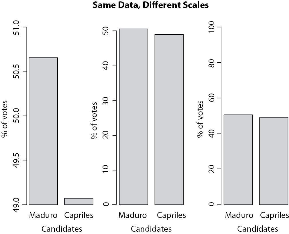
Figure 1: Three ways to present the same data that may lead to different interpretations. Data are from Venezuela’s presidential election counting of votes in 2013. On the left the way results were broadcasted on VTV channel. In the middle, same result presented with scale adjusted to data. On the right, scale was kept to show wider possible interval (0-100).
What about the main results? Before you decide between tables and graphics (text is never good to communicate main quantitative results), you must decide what kind of information you want to communicate. While tables are better to show specific information, graphics are better in communicating trends and comparisons (3), which are usually more related to practice (4). Statisticians always like tables more than graphics, because they do not fear numbers and with tables it is possible to do the maths again, checking results. However, in general, people have difficulties in perceiving trends, patterns, and the magnitude of differences from numbers alone. They will understand the results better if looking at lines and bars, using the great ability of the human eye to detect patterns from visual stimuli (3). We usually work better with qualitative information (“treatment A is more efficient than treatment B”) than with quantitative ones (“group one presented 75 ± 27 kg and group two presented 90 ± 35 kg of body mass”).
If you decided to present your data in a graphic, of whatever kind, you must follow some basic rules. They are so basic, and so simple, that it is easy to forget them. Most of these omissions, fortunately, do not pass the peer review process. Nevertheless, this will cause you some unnecessary waste of time and frustration. So, let us see three of these basic rules: correctly identify each component of your graphic, pay attention to the scales, and do not waste space with unnecessary details.
First, your graphic is designed to present data to others. Do not expect everyone understand your data as you (supposedly) do. This means that you need to label every axis in the plot, preferably providing the units (years, cm, mlO2.kg-1.min-1, etc.). In addition, it is important to provide legends to data when more than one series of data are plotted. This is very important because, as stated before, people will look for trends and patterns in your graphics. How would they know what it means unless they correctly identify which variables are being plotted?
The second important rule is to be careful with scales. There are many cases where the best, or more appropriate, choice is not so clear. Although anyone could say, looking at Figure 1, that the first plot presents an inadequate, biased, scale, the choice between second and third plots is not so trivial. In addition, there is no direct answer. As a rule of thumb, we must remember the purpose of the graphic. Look at your graphic and ask yourself if it is telling you the “truth”, or, in another words if data is accurately presented. Scales should show great differences only when they really exists. In Figure 1, specifically, it would be preferable to use the second plot, because it allows a good view of the difference without distorting it, and there are not much blank spaces in the graph. However, again, there is no “right” answer.
The third rule is the more important one for the design of a good and informative graphic and is also the one most violated in published papers: “save the ink!”. This statement was presented by Connor (4), based on ideas of Tufte (5). All parts and components of a statistical graphic must to be designed to transmit important information to the reader. To Tufte, “graphical excellence” is to show more ideas in the shortest time with the least ink (5).
It is rare to see published graphics without axis identification or without legends. They do not pass the peer-review process, as said before. However, it is not unusual to see coloured figures, full of shapes, lines, extra dimensions and other components and attributes that are completely meaningless. An idea from Few (6) is that if someone start to use random ATTRIBUTES whenwritingtext, the reader wouldimmediatelythink that something was wrong. Don’t you agree? But it is OK to use random attributes when plotting data? Each colour, each form, even the size, must be used to show aspect feature of the data or not used at all. For instance, it is not unusual to see graphics like Figure 2, where different shades of gray are meaningless, since all bars describe the same variable, and consequently it serves only to distract the reader.
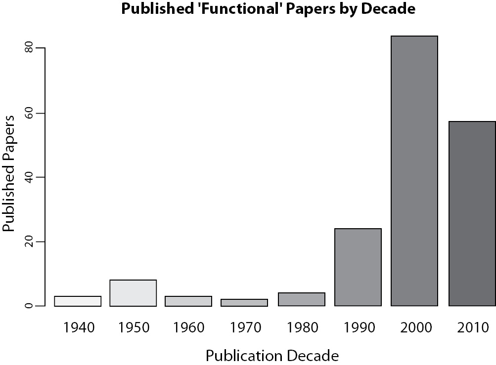
Figure 2. Number of papers published about physical training using the word “Functional” at title, abstract or keywords in the search.
With these three basic rules, the next tough question to answer is: which graphic model should you choose to present your data? Two types of graphics will be presented here: basic and advanced. In this paper, basic graphics are those usually found on the majority of papers, like bar plot, line plot, histograms, etc. This kind of graphic presentation will fit well to almost all research designs and can easily be constructed using common software with some “clicks”. On the other hand, advanced types here will focus specially on the presentation of multivariate model results and other relatively unusual graphics. It is impossible to cover all the types and just some very interesting ideas will be approached that can be used directly or as an idea to even more elaborated graphics that will fit to your particular data.
Basic graphic types
Line and bar plots are some of the most basic and most useful statistical graphics. They are simple, direct and clear. When should you use one and not the other? If you have longitudinal data (like a time series), you should prefer line plots, given the continuity of the line. And this is also the exactly argument to not use line plots with data of independent observations or variables. For instance, see Figure 3 and observe how line induces you to perceive continuity.
As previously said, graphics are good to communicate trends. Line plots show trends by the slope of their lines. Nevertheless, for independent or categorical variables, lines will transmit wrong information. Does continuity make sense in figure 3?
An unusual line plot is presented in figure 4. This graphic describes simulated data from a very common research design where a group is assessed before and after a treatment. Since you have a small sample size, why not present all data instead of just means and standard deviations? Here, the slopes will show the trend to an effect, which can be confirmed by a statistical test.
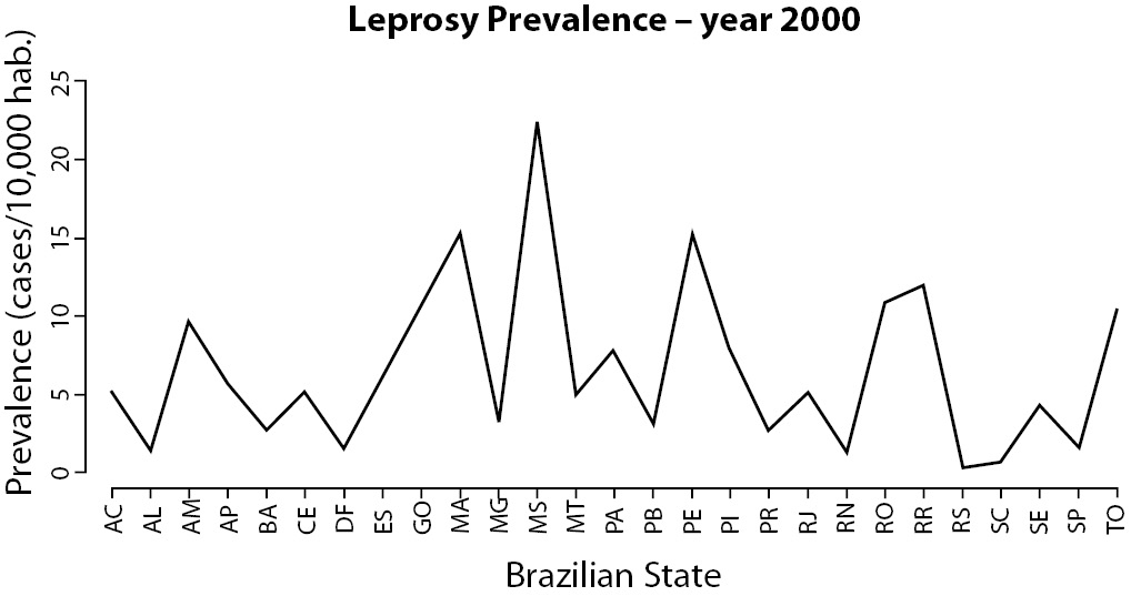
Figure 3. Leprosy prevalence at Brazilian States in the year 2000 (data available at (18)).
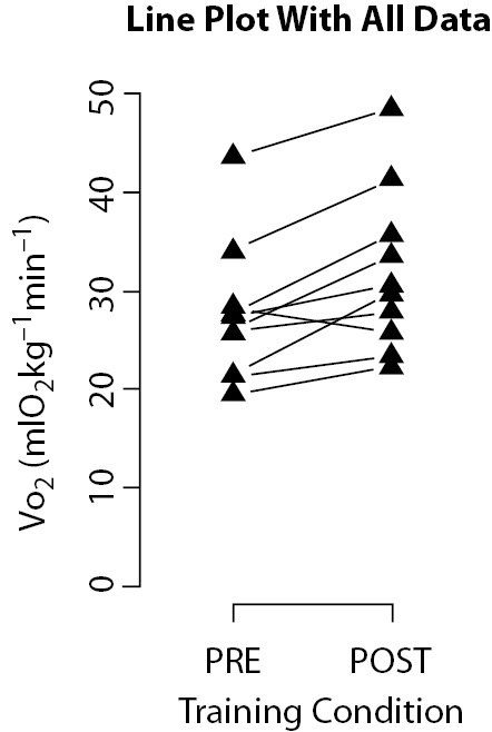
Figure 4. Line plot presenting simulated data from ten individuals before and after physical training. Slopes of the lines suggest a trend to increase maximal oxygen consumption (VO2) response after training.
Of course, this kind of plots can only work under especial conditions that include the already cited small sample size and a reasonable uniform dispersion of data. Otherwise, data superposition would prevent visualization.
Other very popular graphic model is the bar plot. It can be used with both continuous (representing means) and categorical (representing frequencies) variables. Although anyone knows what a bar plot is, there are three very frequent mistakes in its use in scientific papers. The first one is the use of 3D bars, usually together with grid lines (Figure 5a). Remember to keep your graph as simple as possible. The use of 3D bars will just make the understanding harder, while the use of grid lines will not make the task more amenable, serving only to distract the reader. In addition, you should avoid clustering a lot of information on the same graph (Figure 5b). An option to present this kind of data will be described in advanced types below. Preferably, when categories have no natural order, plot them in a descendent order of frequency. Another important tip when using bar plot to present means is to always show standard deviations (Figure 5c).
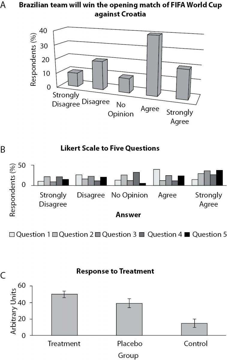
Figure 5. Three examples of bar plots. A: what do 3D view and grid lines add to graphic, beside confusion ? B: so many information in just one graphic is very confusing (see section about advanced models as a suggestion on how to deal with this). C: a good example of the use of bar plots with means and standard errors.
A different form of bar plot that is also very useful is the histogram. The difference between a bar plot and a histogram is that histograms are used to present frequencies (or density) of continuous variables. Histograms are used to describe continuous variables distributions that can be presented both in absolute (frequency) or relative (density) scales. Each bar will describe the frequency of observations between two contiguous intervals, in contrast with bar plots, where each bar describes the frequency of a single category (or value). The additional plot of a line representing a theoretical probability distribution (like the Normal distribution in Figure 6) will help readers to judge the adherence between data and a theoretical distribution.
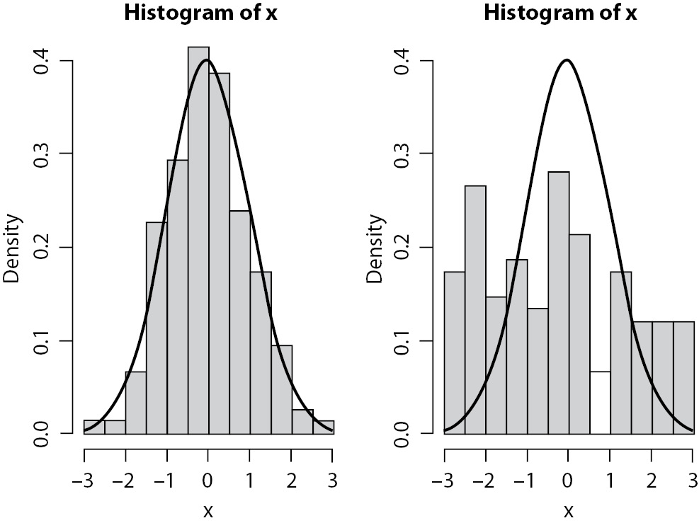
Figure 6. Histogram with probability distribution. Simulated data. On the left, data fits well to normal distribution. On the right, it seems more like a uniform distribution.
Another way to represent data distribution is using box plot or strip plot. Both plots are very similar, since both present data distribution. Box plots (Figure 7) present a box which limits comprise the central 50% of data, the inferior limit of the box indicates the position of the first quartile, which means that 25% of data are equal to or less than that value, and the upper limit of the box describes the third quartile, which means that 75% of data are equal to or less than that value. The line inside the box marks the median value, or the second quartile, indicating that 50% of data are equal to or less than that value. The lines/whiskers outside the box usually indicate one and a half times the range between the third and first quartiles from the box limits. Points outside these limits show extreme values. These lines/whiskers can also indicate either the extreme values (minimum and maximum) or the limits of some confidence interval (e.g., 95% CI). Of course, it is important to indicate what these lines represent in the figure’s legend.
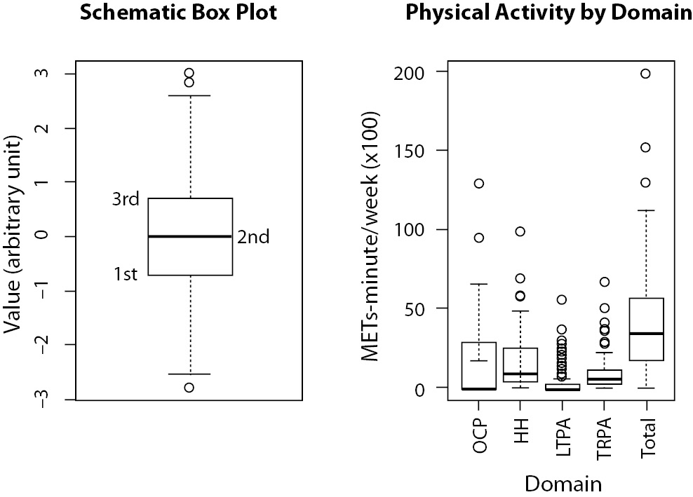
Figure 7. On the left, a schematic representation of a box plot, indicating the position of the first, second (median) and third quartiles. On the right, physical activity (PA) level (in METs-minute/wk x 100) from a group of 135 women presented by each domain from International Physical Activity Questionaire (IPAQ) instrument and total. OCP - PA during work time (occupational); HH - PA during household activities; LTPA - leisure time PA; TRPA - transportation PA. Total is the sum of all domains (unpublished data). Each domain is represented by an individual box plot, similar of that on the left figure.
If we look at the right side of Figure 7, we will see that the occupational domain presents a highly asymmetrical distribution, with 50% of data equal to zero and the other 50% varying from zero to more than 1000 METs-minute/wk. A MET is a metabolic equivalent measure used to estimate caloric expenditure of physical activity. More information on MET can be found in an article by Ainsworth et al. (7). The total domain, on the other hand, is more symmetrical. It is worth of note that we can, with this side-by-side boxplots, compare the distribution of five different variables at the same time on a very compact graphic, which would be impossible with, for instance, histograms.
Strip plots present all data points in the graph. If two data points present the same value, they can be plotted side by side. It is much more interesting when you use both box plot and strip plot combined. We can see (Figure 8), for instance, that only one individual with more than 60 years of age presented high level of physical activity. This information would not be easily identified if using only one of the plots alone.
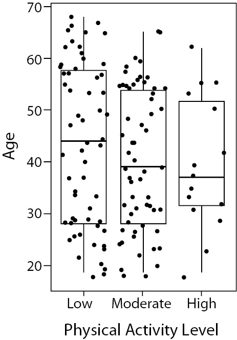
Figure 8. Combination of box and strip plot showing age distribution according to the qualitative (low, moderate and high) physical activity level of 135 women. Note that the majority of individuals above 60 years-old presents low level of physical activity.
Another very common way to represent categorical data distribution is by using pie charts. It is also a good way to miscommunicate your data. Unless the difference among categories is big enough, human eye cannot distinguish among different sizes of pie pieces. Moreover, the problem increases with the number of categories, becoming difficult to distinguish even the categories themselves, especially when the use of colours are not allowed. You can use numbers to identify quantities in a pie chart, but if you need to rely on numbers, why should you use graphics at all? Every author who has written about graphical presentations will not recommend the use of pie charts. It is better to try something different, like a bar plot, for instance.
The last common type of graphic is one of the most useful ones: scatter plots. A scatter plot provides the best way to identify relationships between two continuous variables and is the main graphical representation to be used during exploratory data analysis. Its use will be explored in the following section.
Advanced graphic types
The incredible development of microcomputers has allowed the construction of an almost unlimited number of graphical representations in an easy way. This is good, because the big data era demands more and more ability to present data. Nowadays, everyone is able to plot data into a map easily. Maps, by the way, are resources still underused in scientific papers and that can offer great assistance, especially in epidemiological studies. In figure 9, for instance, we can see leprosy prevalence in Brazil presented in maps. While it is clear that leprosy prevalence decreased between the years 2000 to 2009, only in maps it is possible to see a geospatial relationship. Leprosy is known to be a disease strongly related to socioeconomic factors. Since the South and Southeast regions are the most developed in Brazil, as expected, the leprosy prevalence is the lowest in these areas.
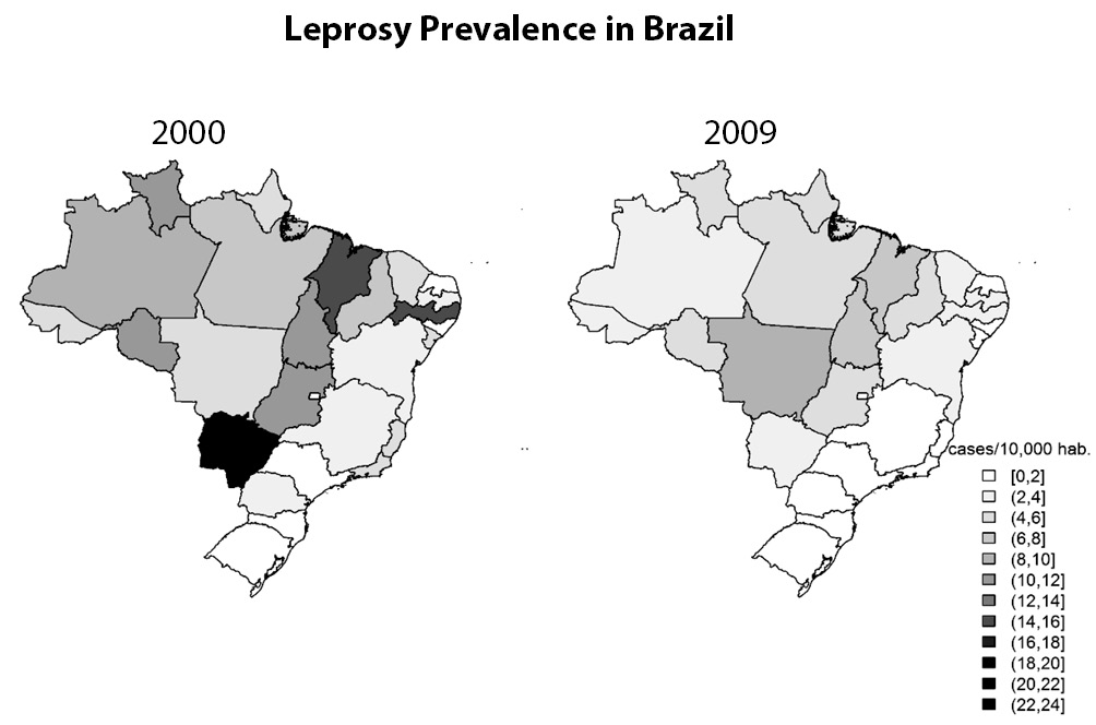
Figure 9. Maps presenting prevalence of leprosy in Brazil in the years 2000 (left) and 2009 (right). Maps allow us to see not just the decrease on prevalence rates, but also an association between prevalence and geographical regions (18).
However, the use of maps only makes sense if the geospatial information is important and if the graphical resolution allows a good visualization. If, for instance, instead of states, cities were plotted, it could be very difficult to clearly identify the information on the map.
One of the greatest difficulties when presenting results is showing complex multivariate models. Usually, multivariate models are presented only as tables, highlighting coefficients, its standard errors, confidence intervals, P values, and alike. One problem with this approach is exemplified by the classical Anscombe Quartet (8). Simple linear regression models fitted to four datasets result in the same equation: y = 3 + 0.5x. They all present the same R2 = 0.667 and the same standard error of β1 = 0.118. Now, let us take a look at the four plots (Figure 10).
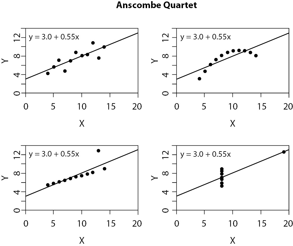
Figure 10. Graphic presentation of Anscombe Quartet (8). Although all can be described by the same equation, with the same coefficient of determination, four datasets are not the same.
It is now clear that describing the statistics related to the model is not enough. But how should multivariate data be represented? This is probably the most complex task in graphic presentation. Some examples will be provided here, but you will need eventually to find your own when fitting it to your data set.
The first suggestion is to create profiles based on the model’s results. For instance, let us refer to Correa et al. (9). The authors present the results of 124 patients submitted to salvage abdominoperineal resection for anal cancer. It was a survival analysis research that found three variables related to survival time: nodal disease, resection margin, and lymphovascular invasion. Since they are all binary (yes/no) variables, it was possible to create 23=8 different profiles from the combination of variables (Figure 11a). Each profile represents one particular survival probability (up to 5-years, i.e. 60 months) and can be plotted on a graph. Clearly, eight lines in just one plot is not the best choice. It was even difficult to choose eight different types of line. The authors proposed a pathological risk score related to the number of positive variables presented by an individual, reducing it to four lines (Figure 11b). It is obvious that this data presentation is much more informative than a table with coefficients and P values.
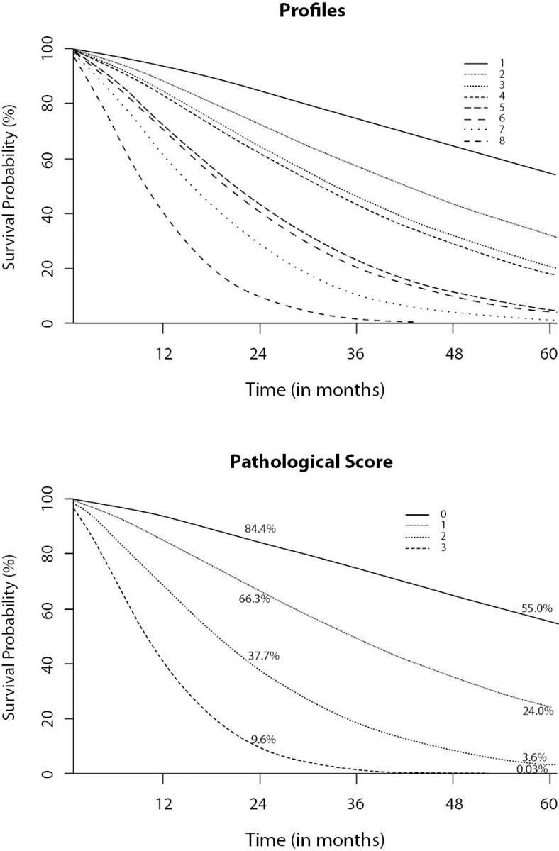
Figure 11. Profiles created from a multiple survival model applied to cancer patients. A: eight profiles created by the combination of three significant variables. B: pathological score based on the number of positive variables (9).
The second suggestion for representing results from multivariate models is widely used by Professor Hans Rosling, one of the most prominent names in data visualization nowadays. His videos on TED project (10) and others that can be found on the web are certainly worth exploring. Figure 12 presents data on the population size, continent, income, and life expectancy of about 200 countries in the year 2010. Incomes are presented in the x-axis, while life expectancies (dependent variable) are presented in the y-axis. Notice that all the “ink” on the graph is used to communicate data. See that geometrical forms represent continents; form sizes directly reflect population sizes.
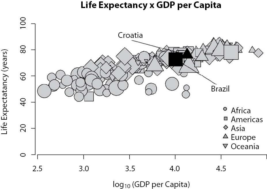
Figure 12. Representation of a relationship among income (Gross Domestic Product per capita) and life expectancy. Each point represents a country. The shape of the points describes the continent. The size of the points is related to the population size
Although Figure 12 presents only year 2010 data, original available data begins at 1810. A video showing the trend, from 1810 to 2010, can be found at website cited in reference 11 (11). Data are available at the Gapminder website (12). With this type of graphic, you must choose one “main” independent variable to be represented in the x-axis.
The third suggestion requires, again, that you have a main independent variable and it was proposed by Paffenbarger et al. (13) in their seminal paper about the relationship between physical activity and cardiovascular health. In Figure 13, it is clear that individuals smoking at least 20 cigarettes/day, but spending at least 2,000 kcal/wk with physical activity present less risk of coronary arterial disease (CAD) than non-smoking sedentary individuals. It is, actually, just a 3D bar plot. However, is an unusual way to represent odd ratios. More than numbers, this kind of plot makes this relationship clearer.
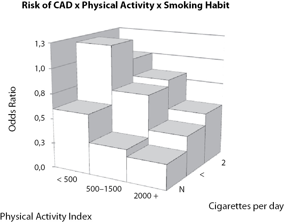
Figure 13. Relationship between cigarette smoking and physical activity on the risk of coronary arterial disease (CAD). Non-smoking sedentary individuals (first column on the left) present greater risk than highly active individuals smoking 20 or more cigarettes per day (third column on the right). Data adapted from (13).
Another common challenge when presenting data is the representation of questionnaire results, particularly those related to Likert scale survey questions. How to describe 20 or more questions, sometimes with more than one group of individuals, without being boring? Generally, authors opt to using several bar plots. Although several bar plots are better than several pie charts, it is difficult to create a whole picture of the data if looking at one question at a time. The best option here is probably the use of a diverging stacked bar chart, a suggestion proposed by Robbins and Heiberger (14). Figure 14 presents simulated Likert data.
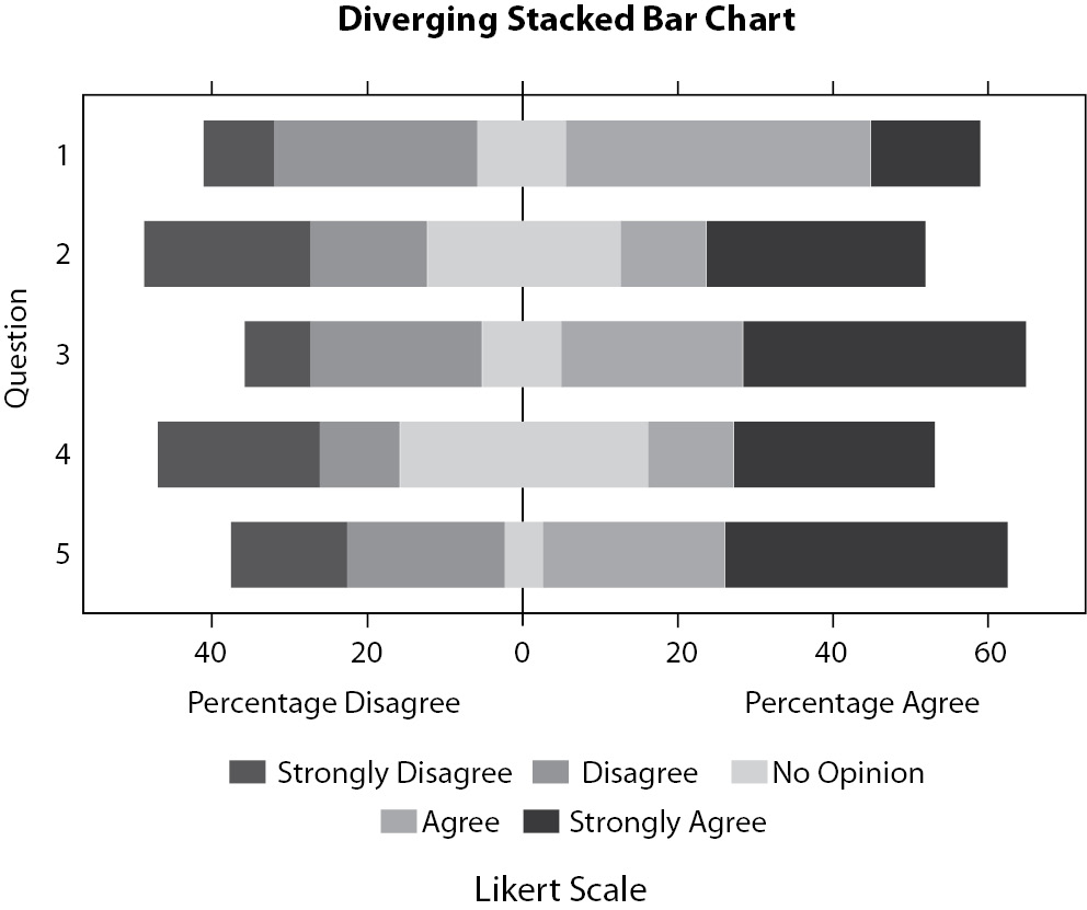
Figure 14. Example of diverging stacked bar chart presenting the same data of the middle graphic from Figure 5. Although it is difficult to compare independent levels among questions, it is easier to compare the level of “agreement” (“agree” + “strongly agree”) or the level of “disagreement” (“disagree” + “strongly disagree”) among questions.
Each bar is centered with neutral category (“no opinion”) equally divided between “positive” and “negative” sides. The purpose here is just to see if there is a positive (“strongly agree” or “agree”) or negative (“strongly disagree” or “disagree”) trend in each question. It would be difficult to differentiate between subcategories inside each question.
The last idea of graphical presentation that will be shown here is not necessarily related to multivariate models but to an emerging field of study, social networks. Social networks are a powerful tool used in different fields of science, from epidemiology to economics (15). In addition, social network studies rely mostly on graph theory. Visually, a graph is a map of nodes linked by edges. Each node represents an “individual” and the edges represent the “relationship” between individuals. Figures of graphs are not easy to draw. A simple representation of 50 individuals can be a mess (Figure 15) and the use of special software like Gephi (16) may be necessary.
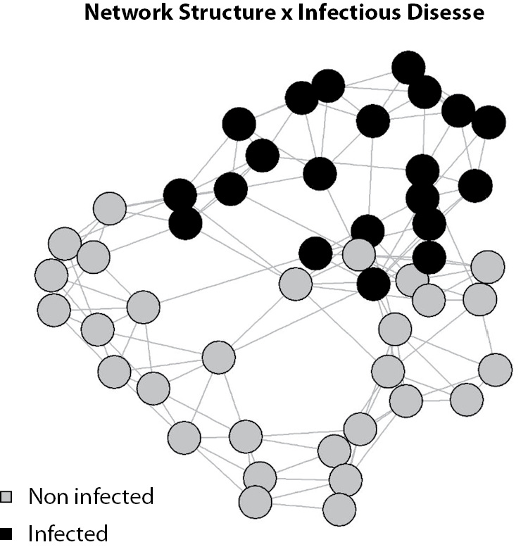
Figure 15. Simulated network structure of 50 individuals. Each circle (node) represents an individual and each line (edge) represents a relationship. It is possible to see that the simulated disease is dependent on the network structure (e.g., an infectious disease).
To try a graph application, anyone with a Facebook account can use Touch Graph application (17), which will generate a graph of your own Facebook network.
Conclusion
As we reach the end of this paper, you are probably thinking about which graphic to use, after so many examples, and, most importantly, how to do it. The first question is the harder one and will depend on your data. First, considering your data, think about the type of graphic you want and what it must show, and only then begin to think about how to do it. Do not allow that software limitations determine which type of graphic will be used. If your software cannot build your desired graphic type, change the software, not the type of graphic. It is important to construct your graphical presentation with even more care and attention than you construct text, because graphics are meant to communicate results, the most important part of the research. Finally, it must be said: do not be afraid to try something new. It is a good practice to look at published papers to see how they did it, but it is important to keep an open mind about how to represent your results.
Acknowledgements
Author would like to thanks to Dr. Arianne Reis and Dr. Marcelo Ribeiro-Alves for the valuable manuscript revision and suggestions. Author is the recipient of a postdoctoral scholarship from Fundação de Amparo à Pesquisa do Estado do Rio de Janeiro (FAPERJ) and Coordenação de Aperfeiçoamento de Pessoal de Nível Superior (CAPES).